Ever envisioned a world where your packages glide through the skies with the precision of drones?
SCROLL DOWN TO DISCOVER THEIR STORY
Who are they?
Arcuas, a drone-delivery tech start-up, is poised to become a frontrunner in the global drone delivery arena by offering rapid, secure, and seamless pick-up-to-drop-off services.
PROJECt typeClient Project @ Careerist
roleProduct Designer
timeline6 weeks
What did they seek?
Arcuas needed to streamline their internal operations’ fleet management dashboard to improve overall efficiency. During the initial stakeholder meeting, the surrounding comments and concerns were shared…
Need to reduce the amount of steps when adding or assigning orders to drones
Notifications must be noticeable enough to quickly respond to
Human error is a big factor - automating everything is the ideal goal
Need one integrated interface to oversee other activities
Key Challenges
Through the lens of opportunity, challenges became catalysts for innovation.
CHALLENGE #1The diversity of drone pilot experiences highlighted the need for a seamless and easy-to-understand fleet management dashboard
exampleWhether a drone pilot had years of experience or was a new hire in training, the dashboard's lack of a clear user journey and functional overview made it difficult for all users to navigate effectively, regardless of their expertise level
impactThis confusion and frustration among users—both drone pilots and management—led to slower response times and delayed deliveries
CHALLENGE #2Addressing safety concerns and potential issues with drones and their surroundings emphasized the need for real-time alert functionality
exampleWhile assigning delivery orders, users struggled to identify critical alerts due to the dashboard's lack of clear visibility and notification functionality. This made it difficult to monitor drone statuses, such as low battery levels, sudden technical failures, or environmental hazards
impactDelayed response times heightened safety risks, like mid-flight malfunctions or obstacles, which led to slower deliveries and potential negative customer experiences, damaging the company's reputation
CHALLENGE #3Recognizing the need for software feedback, we explored ways to optimize the operational workflow for improved oversight and efficiency
ExampleManagement found it difficult to track drone performance and recurring issues because the dashboard lacked logs and detailed reports, making it impossible to analyze trends or pinpoint specific problems
impactWithout this critical feedback, management struggled to solve problems quickly, hindering their ability to scale effectively and reduce the risk of lost growth opportunities or sponsor support
Discovery
[ COMPETITIVE ANALYSIS - TAKEAWAY ]The ever-evolving nature of the industry meant that information online was limited, pushing us to dig deeper to uncover what could keep Arcuas competitive for the long haul. One key insight stood out: reducing delivery time was crucial. This realization set the stage for brainstorming solutions, where we focused on tackling weather dependency and envisioning an integrated, user-friendly dashboard—one that pilots could not only rely on but quickly learn to master.
As part of our discovery phase, a competitive analysis…
a subject matter experts’ questionnaire ,
…and a contextual inquiry was conducted.
[ QUESTIONNAIRE - TAKEAWAY ]Through this phase, we gained valuable insights into their work environment and challenges. We identified when most issues occurred, the types of problems they encountered, and the areas that held more importance to them, helping us better understand their needs, goals, and pain points.
[ CONTEXTUAL INQUIRY- TAKEAWAY ]The contextual inquiry helped us take a closer look at how users interacted with the dashboard in their day-to-day tasks. By observing them assigning and managing orders, we uncovered some unspoken needs that had a real impact on their workflow. For instance, their sorting system for tracking drone statuses—whether en route, ready for takeoff, or assigned—wasn’t effective. Users couldn’t see all the drones at once, as each category would collapse after being viewed, causing frustration and inefficiency. This phase not only revealed new insights but also validated many of our earlier assumptions.
Key Insights
Identifying Their Biggest Pain Points
What was observed?
Drones tend to have the most issues during delivery
Platform is not easy to quickly learn
Most important features are:
viewing and creating orders
assigning orders to drones
visibility of drone statuses
drone battery percentage
speed and geographical info
What was learnt?
Inconsistent navigation bar, causing confusion
Uniform drone color hindering identification
Complex drone management limiting visibility
Excessive clicks for simple operations
Manually entering customers’ data reducing efficiency
Insufficient weather data for informed decision-making
Lack of dedicated data management to identify and resolve future issues
Their biggest pain points occurred once a drone had been sent out on its way to make a delivery — between step 3 and 4 as shown above.
How might we enhance a
drone pilot's capacity to manage up to
15 drones using Arcuas' software efficiently?
Goals
My team and I saw the need to create an efficient workflow to help Arcuas deliver top-notch customer satisfaction while preparing their system for future growth in the fast-moving tech industry. To tackle this, we divided our work, each focusing on specific areas as outlined below.
user goals:I solely focused and worked on
To provide a streamlined system that reduces unnecessary steps, enabling users to assign orders, monitor statuses, and handle alerts with ease
To achieve seamless integration of tools and information, ensuring users can access everything they need in one unified platform
To optimize the interface for user-friendliness, making it intuitive for both seasoned drone pilots and new trainees with clear visual cues and logical workflows
To ensure reliability in operations by minimizing errors and delays, allowing users to focus on critical tasks like responding to high-priority alerts or resolving technical issues
business goals:Team solely focused and worked on: Orders, Maintenance, or Settings
To provide a simple way to track orders, making it easier to spot delivery problems, fix them quickly, keeping customer satisfaction and retention
To analyze root causes of delivery problems to fix tricky routes, cut delays, and make deliveries more reliable, keeping things running smoothly
To identify patterns in maintenance issues to address recurring faults and replace unreliable parts, extending equipment life and reducing repair costs
To deliver transparent reports that highlight trends and challenges, providing managers and executives with clear operational insights to drive data-informed decisions, foster innovation, and maintain a competitive edge
From this point forward, I will only showcase the specific work I was responsible for.
Design Adaptability
The company's initial software design:
Their initial software design had numerous flaws that caused frustration for drone pilots. Just to highlight a few, for instance, the navigation bar was highly inconsistent; it would change based on the task, sometimes displaying the "mission tab" and other times omitting it. This left drone pilots confused about their next steps and wasted valuable time trying to refocus.
Additionally, the filtering system failed to provide an overview of all drones for easy visibility. Pilots had to manually click on each drone to determine its status—whether completed, in progress, en route, or otherwise. Overall, the system was not user-friendly and significantly complicated tasks, making pilots’ jobs far more difficult than necessary.
Instead of helping pilots do their job, it made everything more complicated than needed to be.
The Lifecycle of a Design Idea
This was my first design, inspired by Apple's dock interface on their laptops and desktops.
My initial thought was, "How can I make the best use of space?"
I thought that by being able to use a horizontal space, it would help manage multiple drones. I soon realized that the size of each drone icon didn't leave much space for a good filtering system. On top of that, the notification system didn't really give off "urgency vibes" - lacking that attention-grabbing element it should provide.
After designing not just the default main page of the dashboard but all the other pages as well, I navigated through them thoroughly, putting myself in the shoes of a drone pilot. That’s when I realized there were still areas that needed improvement to make the interface more user-friendly. One of those was the drone image in the side panel—it looked nice but didn’t serve much purpose beyond visual appeal. Recognizing the untapped potential of that space, I was pushed to explore and iterate on new design concepts to make it far more functional.
After exploring various design concepts through iteration and performing a usability test, an evaluation of what worked and what needed further improvement was observed and noted — as shown below:
GREEN = AREAS THAT WORKED RED = AREAS THAT NEEDED IMPROVEMENT
Almost There — The Final Vision in Progress
Even though I had found a better place for the drone image, it still didn’t serve any functional purpose. During the usability test, I discovered that the team actually relied on a compass to verify and manage drone positions during deliveries. The compass helped them assess situations like abnormal angles—if the compass displayed a degree above a certain threshold and triggered an obstruction alert, it would usually indicate that the drone was either stuck or even be upside down. This information allowed them to evaluate the situation more effectively and take informed actions to resolve it.
There were still areas that needed attention, such as aligning the colors with the brand palette and refining rough edges. The sorting and notification systems called for simplification, and the visibility of drones on the map needed improvement to clearly indicate their status. With opportunities to boost the dashboard's efficiency and overall usability, I rolled up my sleeves and got back to work.
A second usability test was conducted to evaluate the effectiveness of the new design changes and to identify any other areas needing further review.
GREEN = AREAS THAT WORKED RED = AREAS THAT NEEDED IMPROVEMENT
Calibrating the Final Flight Path…
In this version, I introduced a:
refined modal window,
a dashboard featuring a unified color palette based on the brand,
the weather widget was made clearer,
the sorting system simplified,
and the notification system became more noticeable, with two options for responding.
Additionally, I made it easier to differentiate drones on the map based on their status. I addressed all the elements that needed improvement from the previous usability tests with the client, and they were pleased with the progress.
However, I still felt ✨something was missing—a special spark✨ that could make their work even easier. That’s when I realized they had no way to zoom in on the map to see the exact location of the drones and better assess any situation. So, I got to work, one last time.
Final Design
The final design presentation to the stakeholders was a resounding success, with every concept and feature receiving high praise and no negative feedback. The following snippets provide a detailed overview of each feature and the impact provided.
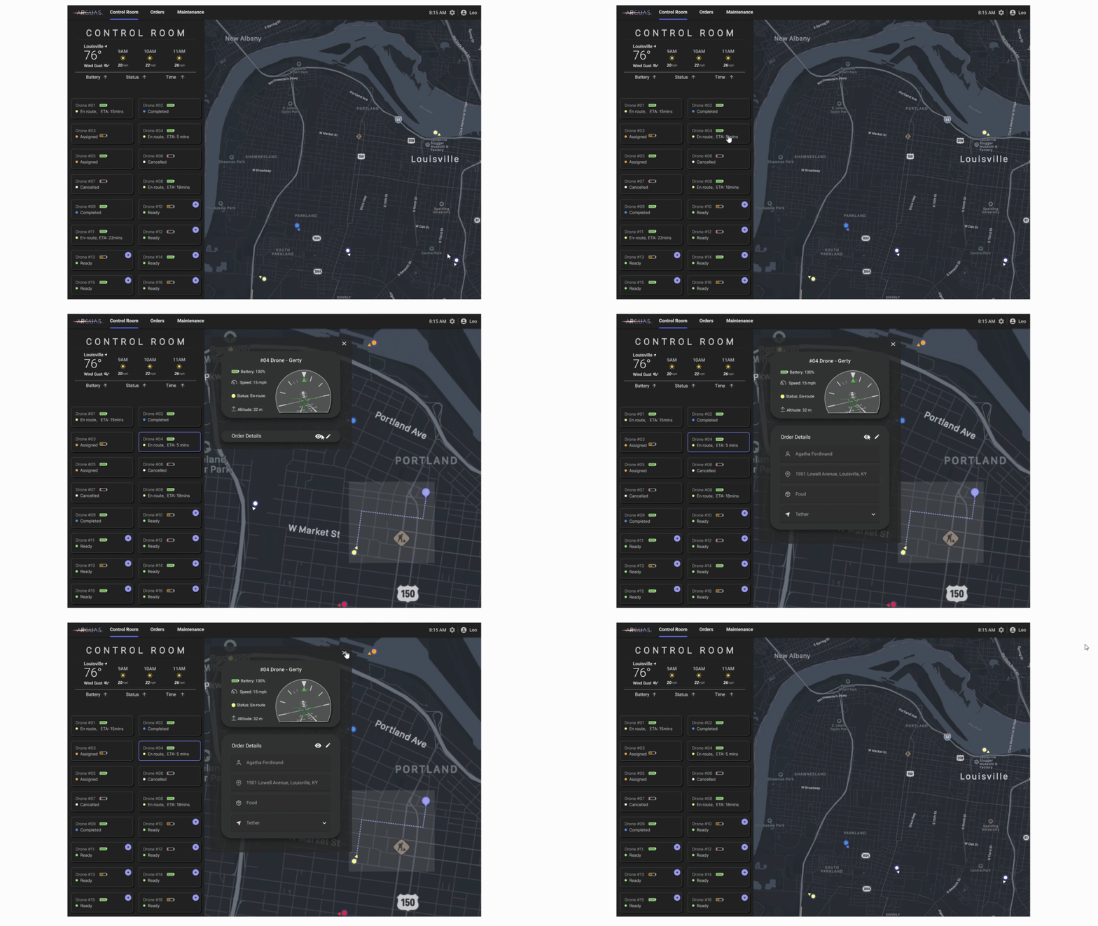
Drone Location Precision
Drone Selection
Enables map scrolling for precise location identification on the map
Displays comprehensive drone statistics including a directional compass
Provides options to view or edit the displayed drone information within the panel for verification and record keeping purposes
Highlights the selected drone on the side panel to visually ensure correct selection
benefits:Allows to accurately locate drones, accessing real-time stats, updating records easily, and avoiding selection mistakes
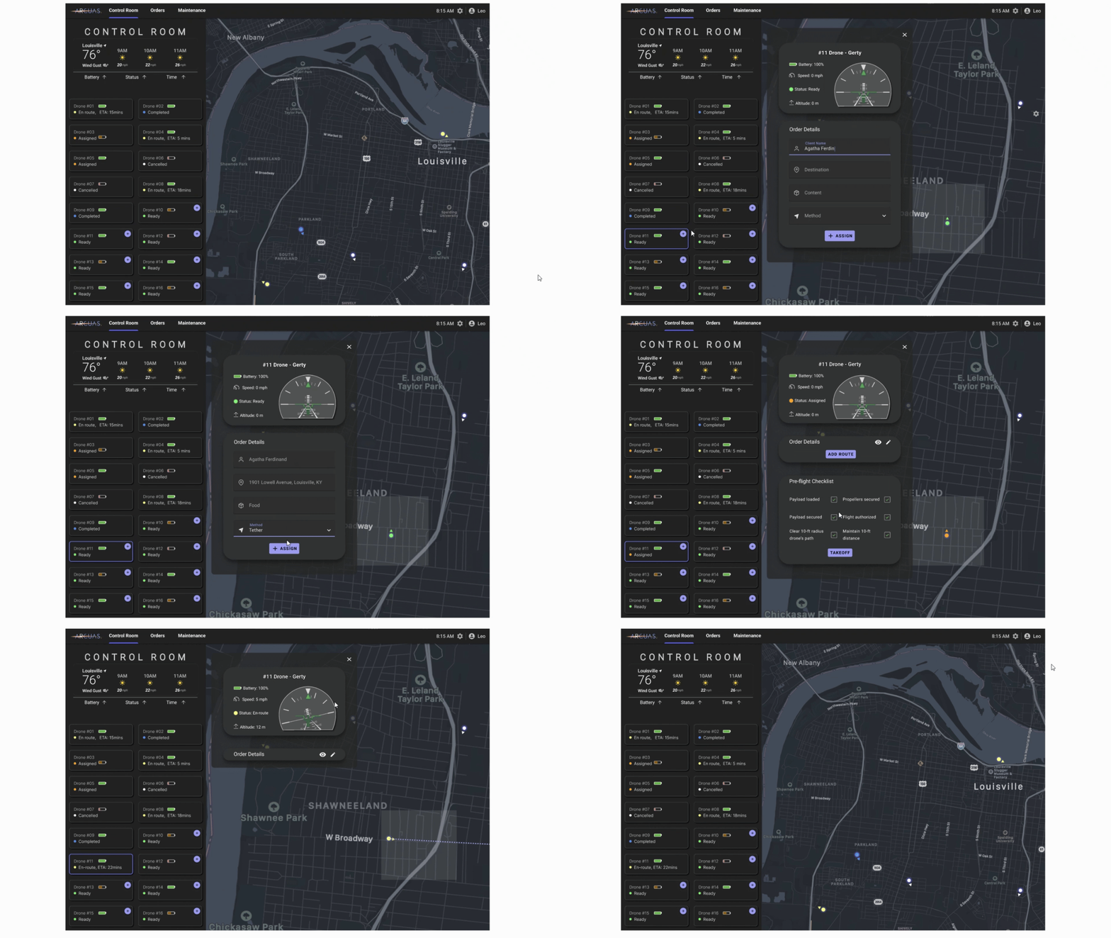
Adding an Order
Effortlessly direct the map to the precise location of a chosen drone with a simple click
Elevate the experience by not only pinpointing the drone on the map but also providing quick access to essential drone details
Color-coded drone highlighting based on status, streamlining pilot workflow and enhancing multitasking for managing numerous drones simultaneously
benefits:Reducing manual searching for quick situational awareness, quickly viewing data without switching screens, and enabling quicker responses for a better efficient management of multiple drones
Users must click the purple "plus" button associated with a specific drone to add order
Drone pilots manually input order details as automation is currently unavailable. My design envisions implementing automation to streamline this process in the future
Upon assigning the order, pilots must complete a comprehensive safety pre-flight checklist, ensuring every box is checked
Displays the corresponding status throughout the entire order process, providing clear visibility of progress
benefits:Enables order assignment with one click—due to a small, distinct plus-sign button that cues users—demonstrates future auto-fill for client info (currently manual), and ensures safety with a pre-flight checklist before delivery
Enhanced Multi-Stop Design
This feature enables the following:
Assigning multiple orders (maximum of three) to a single drone
Adding orders and managed in one centralized location
A clear visual display of order locations on the map, complete with the drone's plotted route
Easy tracking of the drone's progress along its route, allowing pilots to quickly determine its current stage
benefits:This feature helps pilots manage multiple orders for a single drone in one place, visualize the route clearly on the map, and easily track progress, making deliveries more efficient and organized
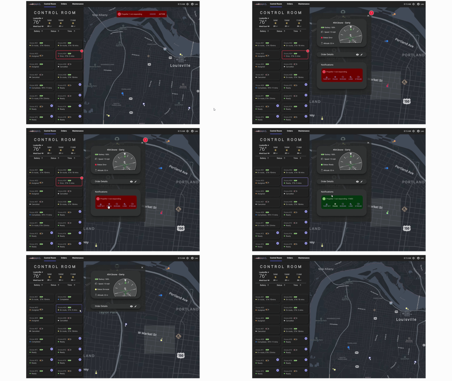
Advanced Notification System
A red alert notification appears at the top of the screen, highlighting the drone in on the side panel and on the map red
There are two ways to check what's going on—either by clicking "action" on the alert notification or simply selecting the drone from the side panel
Immediate action buttons accompany the drone information panel to act accordingly to the issue presented
Once the issue is resolved, the action buttons in the drone information panel turn green, signaling the pilot to resume operation and updating the drone's status accordingly
benefits:The makes urgent issues easy to spot with red alerts, grabbing attention right away. Drone pilots aren’t restricted to just one way of responding. Action buttons allow for quick responses, and once the issue is resolved, the buttons turn green, updating the drone’s status and reducing downtime
Ding ding ding!
✨This feature was exactly the spark the entire system needed!✨
The stakeholders had briefly explored the idea that, since their drones could carry up to 20 pounds, they could potentially deliver up to three orders per drone. I took that idea and designed a possible solution that they could implement down the road, showing them how it might look in the future.
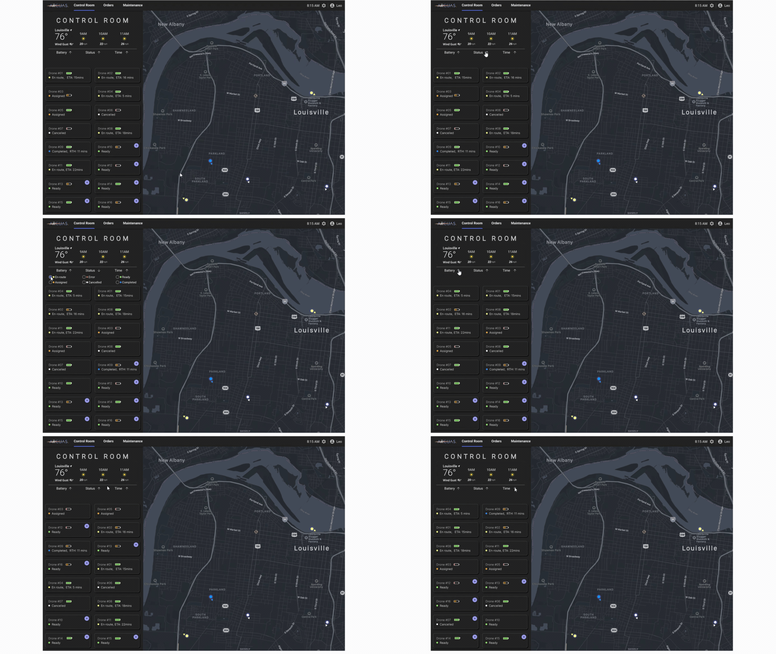
Drone Sorting Mechanism
An enhanced feature that empowers drone pilots to effortlessly organize drone data across three distinct categories: battery, status, and time
Simple sorting, by clicking the arrows to arrange data in ascending or descending order
Drone pilots can organize drones in the way that best suits your needs
Quick Control for a streamlined workflow
benefits:This feature lets drone pilots easily organize important details—like battery life, status, and time—in a way that suits them best, helping make their day-to-day work a lot smoother and less stressful
Future Anticipated Results
-
Satisfaction Rate Increase 🤩
The drone pilot and CEO both expressed strong satisfaction with the design improvements. While it's difficult to provide specific percentages due to the small sample size, it was evident that the changes had a positive impact on user satisfaction.
-
Task Management Efficiency 🎯
Users really appreciated the improved task management features, with feedback showing excitement and optimism about how much it would cut down on task completion time. This indicates a boost in operational efficiency, allowing for smoother management of up to 15 drones at once, ultimately resolving their main concern and challenge at the beginning of the brief.
-
Impact on Business Goals 🚀
Due to the excitement expressed about the potential impact of the design changes, it's tough to pinpoint exact percentages, but the overall positive feedback clearly suggests an improvement in operational efficiency and a reduction in errors.
Key Takeaways
Working in a startup environment as a new designer was both exciting and eye-opening. It pushed me to think differently, adapt quickly, and find creative solutions within existing constraints. Every challenge became a learning opportunity, helping me grow in ways I hadn’t expected.
Here are some of my biggest takeaways from the experience:
-
The Art of Repurposing ♻️
As a new designer, my first instinct was to redesign everything from scratch. But thanks to the lead designer’s guidance, I learned a crucial lesson—great design isn’t always about starting over, but about repurposing what already exists. By working within the existing UI kit, I discovered how to enhance features in a way that felt fresh without reinventing the wheel. This completely changed how I see design, unlocking a new level of creativity. It taught me that even if a software’s functionality isn’t perfect, there’s often value in what’s already there—elements that can be salvaged, reimagined, and used in a way that better serves the business and its users.
-
Design is a Team Sport 🙌
Working with a team of designers for the first time, each with their own creative approach, was a game-changer for me. Brainstorming different ideas made me realize that collaboration isn’t just about pitching your own solutions—it’s about really listening, learning, and being open to new perspectives. I had to let go of the idea that my solution was always the best and instead focus on what actually solved the problem. Compromise and iteration weren’t roadblocks; they were what led us to even better results. Plus, figuring out how to divide work efficiently under tight deadlines was a skill I know I’ll use again. Seeing how different minds came together to create something stronger was truly inspiring
-
Mastering Design, Step by Step ✍️
Being guided by a seasoned lead designer showed me that even the most experienced professionals are always learning. When we faced challenges, he didn’t pretend to have all the answers—instead, we tackled problems together, brainstorming ideas and searched for solutions in real time. He also introduced us to design shortcuts and techniques to work more efficiently, but it was on us to practice and truly master them. This experience showed me that design is a continuous learning journey—one where curiosity, adaptability, and daily practice are key to becoming great
Testimonials
"Throughout our internship, Maria consistently displayed a remarkable level of proactiveness and ingenuity. Her innovative ideas became the cornerstone of the key feature our team was entrusted to develop. Maria's unwavering dedication, expertise, and insight convinced me that she is poised for success in the field of UX design, both presently and in the future."
Leah Thomas
UX/UI Designer
"Maria has been an incredible intern who has made great strides in her interactive thinking and interaction design! Her tailored feedback will make her a great asset to any design team!"
Tajuana Cerutti
UX Designer
Sola Babatunde
UX Lead Designer


